Fernn
Branding * Messaging * Packaging * Web Design + Development
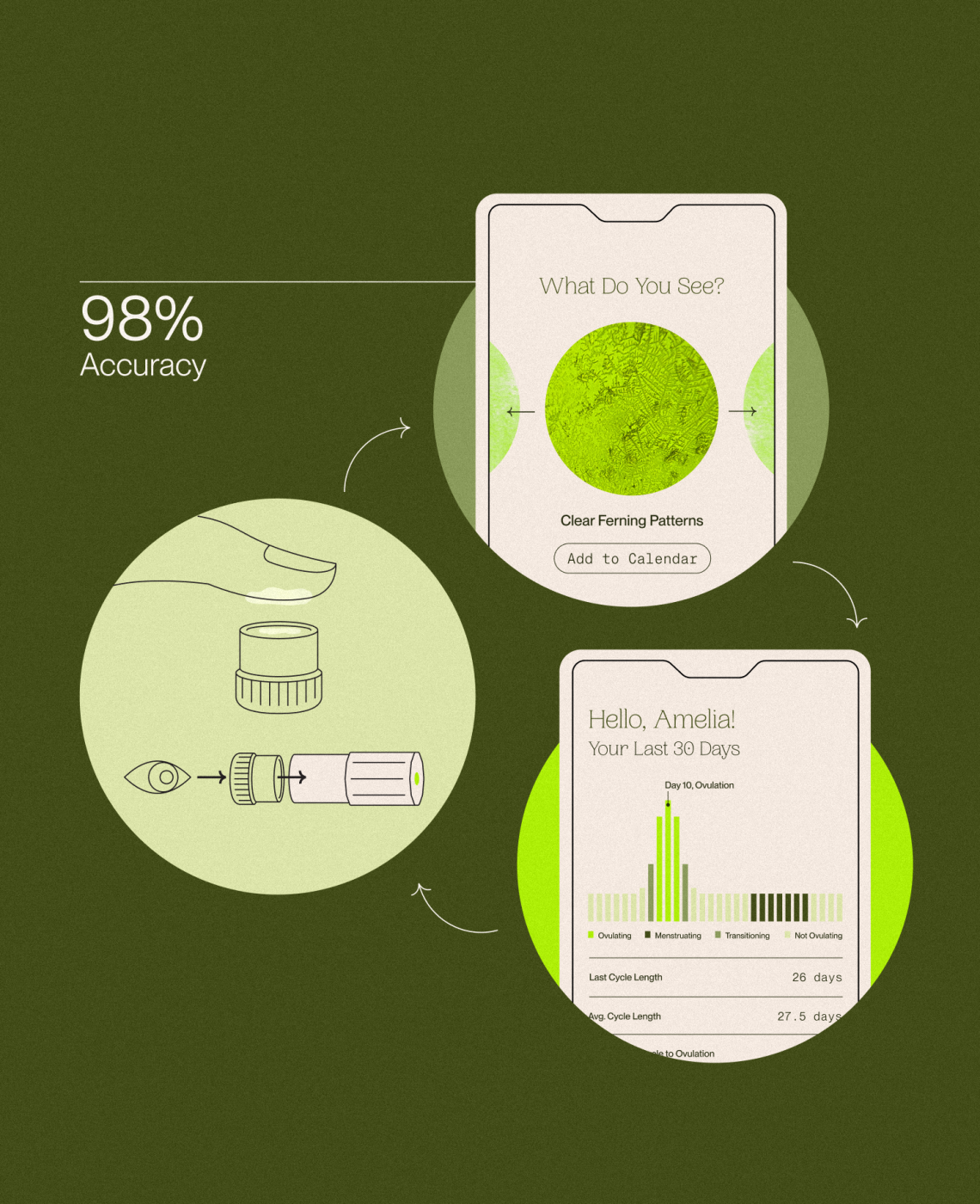
Fernn, an ovulation tracking device and app, needed an identity that would communicate scientific accuracy while feeling approachable to women across all life stages. Fernn’s technology identifies ferning patterns in saliva under a handheld, travel-friendly microscope for accurate ovulation insight. Ampersand translated the shape and neon-green hue of the microscope into a distinctive palette and logo, while abstracting the ferning patterns seen under the lens into brand textures. The iconic mark—an unfurling fern leaf with a nested dot—symbolizes growth, cycles, and safety. The resulting identity gave Fernn a distinctive presence in the ovulation-tracking market, translating the product into an accessible, trustworthy brand experience.